For a long time, I wanted to build a project that worked with end-to-end data, from data ingestion and analysis to the final web app that can be shared with users. I like public transport and, recently, have found a topic worth exploring - the average wait time for a bus at stops. Follow me on a journey of building the project to analyze wait times and documenting it as a series of articles.
Why does the average wait time at a stop metric matter?
The usability of public transport for everyday commutes largely depends on its frequency (there is also coverage, but let’s omit it for now). Less frequent and reliable service is less likely to be used. It is easier to justify using a car when the bus comes only once or twice an hour.
The more frequent the service, the more resources must be dedicated; hence, the transit agency needs a bigger budget. But if we aim for the ideal service, you should see a bus or tram every 5-10 minutes in densely populated areas and in medium-density areas every 10-15 minutes.
At such frequencies, there is no need to check an app; you walk to a stop, and there is a good chance your ride will be within minutes.
There are other nonobvious consequences, such as safety. If you feel uncomfortable in your current bus, taking off at the next stop and waiting 5-10 minutes for the next one does not significantly disrupt the journey.
In my opinion, the average wait time at a stop is a more critical metric than on-time schedule performance. And to improve wait time, it needs to be measured.
About the project
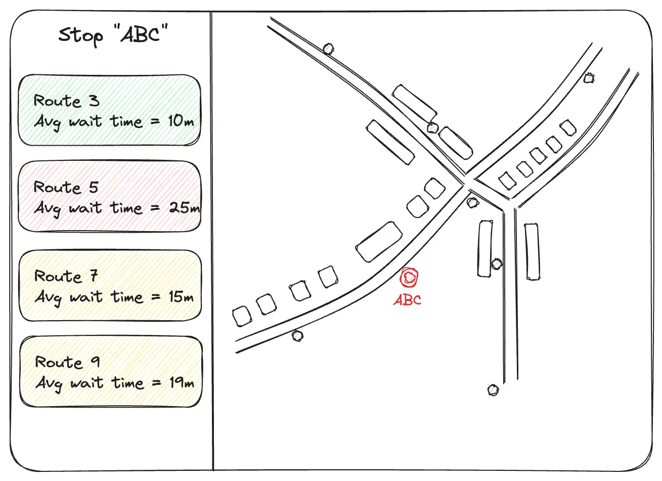
Many public transit agencies provide a real-time feed of their vehicles that can be used by services such as Google Maps and the Transit app. I want to measure the average wait time at a stop by calculating how frequently vehicles visit each stop using real-time vehicle location data. Then, the results will be displayed on the website with an interactive map for users to explore. Below is a mockup of the UI.
For the data source, I chose the GTFS-rt (GTFS real-time) feed from Mississauga Transit Agency (MiWay). I use their services frequently and am interested in wait times for different stops across a city. The project is named MiWaitWay, a tribute to the data source.
This project will be primarily educational, and as mentioned before, I will document a journey in a series of articles.
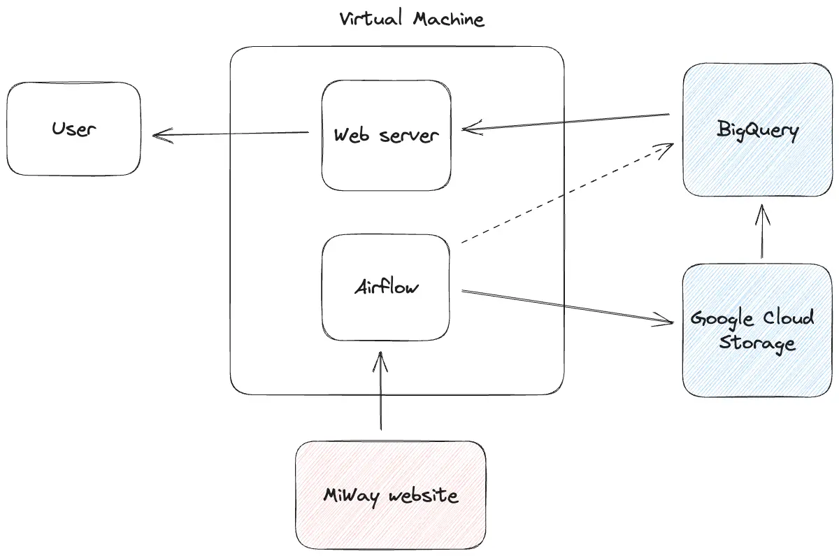
High-level system design
To constrain costs and keep it simple, I will host the project on a single small VM on Google Cloud. Because I want to learn specific tools, part of the tech stack is already decided:
- Google BigQuery as a data warehouse;
- Apache Airflow, a popular data workflow orchestration tool.
The tech stack for the web app will be selected later in the series.
The early high-level system design diagram is below.
A disclaimer: I have already started the project, It is in its early stages. Feel free to check the MiWaitWay Github repository.
Conclusion
The idea to share the project’s progress was inspired by Juraj Majerik’s Building an Uber clone series and subsequent coverage of Juraj’s work in The Pragmatic Engineer. If you are interested, join me on this journey and learn something interesting. Thank you for reading. Have a great day!
Check the first article of this series - “Deploying Apache Airflow on a resource-constrained VM on Google Cloud”.